My 5 interior design tricks of the trade!

These 5 interior design tricks for the trade are just what you need to take your room to the next level.
Layered lighting is everything

Designers use three types of lighting in most rooms:

  • Ambient: general lighting. Eg ceiling fixtures and recessed lights. These will be in use far more in kitchens and bathrooms than living rooms and bedrooms where you want to use more of the accent lighting. Overhead lighting is a good overall light but doesn’t create a cosy mood.

  • Task: functional lighting. Eg desk lamps, under-cabinet lighting. This is more crucial in kitchens, bathrooms and offices.

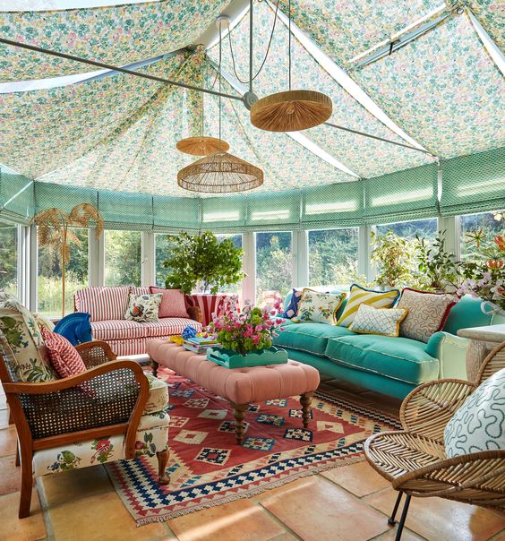
  • Accent: decorative lighting. Eg wall light, picture lights, statement floor and table lamps. This can be in any room of the house, layered with the other lighting, to create interesting pools of lights to highlight certain features.

Moody living room
Odd numbers create visual interest

Styling in groups of three or five for cushions, vases, or artwork, feels more natural and organic to the eye than even-numbered groupings, which can feel too perfect or forced, as life isn’t like that!

Living room showing rug position
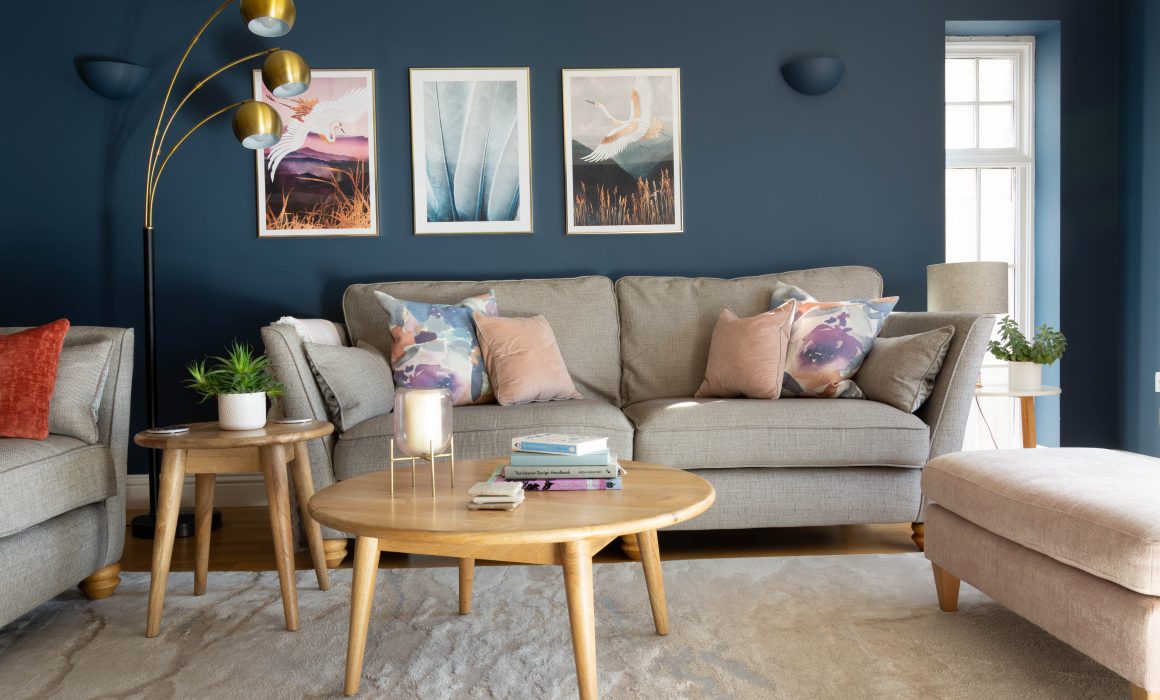
Choose the right size rug

Most people buy rugs that are too small. A rug should ideally go under all main furniture pieces, or at least the front legs, to make the space feel grounded and expansive. So ideally under the front legs of all the sofas in a room, with the coffee table and footstool sitting on the rug. It will be cosier and make the room seem better designed and “finished”. 

Low height ceiling tricks

To make a room feel taller:

  • Use floor-to-ceiling curtains even if your windows aren’t that tall. And that means position the rail as high as you possibly can.

  • Install tall bookcases or vertical art to draw the eye upward.

  • If painting the walls a colour, then consider painting the skirting and any coving the same colour to give the illusion the walls are taller than they are, as you won’t focus on a break in the colour.

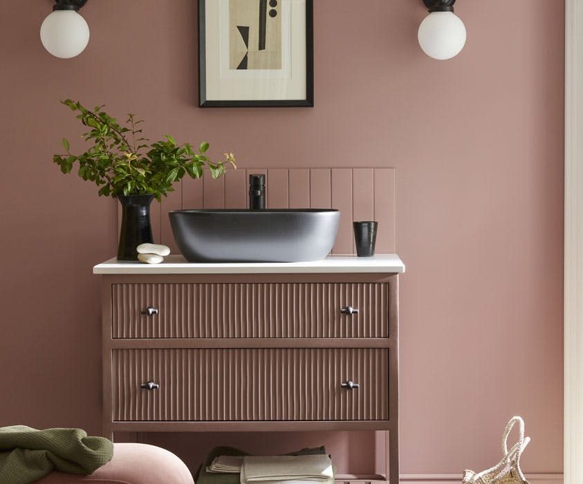
North-facing room solutions

For years many of us painted cold, north facing rooms in pale colours and even pure brilliant white. But did you know that the latter colour has a high proportion of blue in it and is therefore going to make your north facing room seem even colder? 

It’s personal taste but I often advise my clients to embrace the dark and to colour drench these spaces in a rich, cocooning colour. Chocolate shades are really enveloping and cosy and a deep green or blue can bring real drama to a space. Choose your favourite deep tone and create some real atmosphere!

North facing room with dark green walls


How to Create a Moodboard

How many of us start the redecoration process with choosing a new paint colour for their walls or buying a new accent chair on a whim without actually thinking about the room as a whole, the look we want to achieve and the problems we need to solve? We’ve all done it!
However there is a process to creating a room that you will be happy with and the first step for me is always creating a moodboard. Here I take you through how you do this and as a result develop a clear vision for your space, create a cohesive scheme and prevent costly mistakes. Even the creative process needs a plan!

Step 1: Define your vision

Before you start collecting images and materials for your moodboard, take some time to define the vision for your room. Consider the purpose of the space, your preferred style (modern, traditional, eclectic, etc.), and the mood you want to evoke (calm, vibrant, cosy, light, etc.). This clarity will guide your choices as you curate your moodboard.

Step 2: Gather inspiration

Now, it’s time to collect inspiration from various sources. Explore interior design magazines, interior shops, instagram and pinterest to find images that resonate with your vision. Look for pictures that showcase colours, patterns, textures, and furniture styles that align with your desired aesthetic. Don’t limit yourself to just interior design; consider art, fashion, and nature for additional inspiration. This forms your concept.

Interior mood board
Colour palette

Step 3: Select a colour palette

I’m a colour lover so I adore this part! Colours play a significant role in setting the tone for a room. Identify the dominant colours in your inspirational images and choose a cohesive colour palette for your moodboard. Aim for a balanced combination of main colours and accent colours that reflect the mood and style you want to achieve in your space. Bear in mind the orientation and size of the room and whether you want to make it feel bright and airy or dark and cosy. 

Step 4: Collect materials

One step on from the concept – now you can have fun gathering physical materials that represent the textures and finishes you envision for your room. This could include fabric swatches, paint samples, flooring samples, or even small keepsakes or door handles that you love. Having tangible materials on your moodboard allows you to better visualise the overall look and feel of your design. Many websites offer a few samples for free.

Samples
Design board

Step 5: Arrange & edit

Once you have a collection of images and materials, start arranging them on a board or a digital platform. Canva is a fantastic free online graphic design tool. Play with different compositions until you find a layout that makes you happy. Take note of the ratios of each colour when you turn your scheme into reality. Save or photograph your board.


Step 6: Turn it into reality!

Use the finalised moodboard as a roadmap for your room design. Refer to it when selecting furniture, paint colours, and accessories. The moodboard will serve as a visual guide, ensuring that every element contributes to the cohesive and inviting atmosphere you’ve envisioned.

Image credit = Oliveri Kitchens

Finished kitchen


How to turn your conservatory into a welcoming room that you actually use

So many people have conservatories that they can’t use all year round and they just become a dumping ground for garden furniture or drying washing. I have some great tips on how to make the space useable and not just that storage room you have to step through to get to your garden!

Tip 1: Always start with a good clear out and declutter and consider which furniture to keep and which to upcyle to fit your new scheme. Be ruthless – if you’ve not used something for a whole year, you are unlikely to ever use it again. Remember though that someone else might want it. I giveaway items on my local Facebook pages for free and they nearly always get snapped up that same day, which me makes feel a lot better than going to the tip.

Tip 2: To stop the extremes of temperature you can fix solar film on the roof to stop the sun’s glare. Go one step further and fix some beautiful fabric drapes to the ceiling to give a cosy tented look. See what Sophie Robinson has done in her conservatory in the image below – maximalist but stunning! This also helps retain heat in winter. And blinds on the windows is another investment that will add to the cosiness.

Image: Sophie Robinson

Conservatory with beautiful interior
Conservatory painted wall

Tip 3: Most conservatories have a low brick wall under the windows and bricks where they join the house. Painting these a colour that fits the palette of the room is a great idea – or for a more finished look plaster them first then repaint them. 

And of course it doesn’t have to be a neutral colour. Pick out a key colour from your scheme. Remember with light flooded rooms – especially south facing – any paint is going to feel warmer as the red and yellow tones will be brought out. If you want to “cool” it down consider going for grey or blue based colours.

Image: Sophie Robinson

Tip 4: If your windows are white PVC then I have seen people totally transform them inside by painting them. Use a good primer then paint them in the same colour as the walls. Personally I’d choose a dark earthy neutral for this, to get away from the shiny white PVC look. If you’re feeling brave, go for a colour as Sophie has done in the previous image! But just remember if you tire of it, re-painting window frames is a much bigger job than repainting walls, so choose a colour you’ll love for a long time.

Tip 5: If you want to create a snug / lounge type space then arrange comfy chairs around a coffee table in the middle, rather than looking out into the garden, to make the space more sociable and to enhance the feeling that this is a room in its own right. 

There’s nothing worse than a doctor’s waiting room feel where everyone is sat facing the same way!

Image: Westbury Garden Rooms

Tip 6: There are plenty of accessories that will cosy up your conservatory – a big rug that fills the space and feels warm underfoot and plenty of throws and cushions in different textures and patterns. These are the finishing touches that bring the accent colour and, of course, warmth into your scheme. Relatively speaking these can be picked up fairly cheaply from shops like TK Maxx, or why not re-purpose something from elsewhere in your home?

Tip 7: Finally don’t forget “layered” lighting – floor lamps, table lamps and even fairy lights hung from the high ceiling. They create different pools of light which make the space really inviting. 

If you haven’t got enough electrical sockets, there are many more battery operated lamps on the market now. Unless you can afford to fit more sockets then this is a far better solution than unsightly extension cables.

And remember the candles at night – beautifully scented ones will really enhance the mood and feel of your welcoming “new” room.


Image: Westbury Garden Rooms


Uplifting summer colour schemes

Are you scared of colour or just unsure how to use it? Perhaps you don’t know how much to use or how to mix it with other hues? Many of us play safe with neutral walls, but we could be missing out when colour can bring so much joy. With summer almost upon us now is the time to let a little more into your life. Below are five of my failsafe colour schemes, whatever your preference.


Mix blues with terracotta

Think refreshing, bright summery blues such as Little Greene’s Sky Blue or Benjamin Moore’s colour of the year Blue Nova, with hints of violet. Mid blues are an uplifting change from the darker blues we have seen around for a while. They compliment beautifully with terracotta shades. This scheme works well in a south facing living room – go bold and colour drench the walls, ceiling and paintwork in mid blue, for a totally immersive look, and bring in cushions and curtains in rusty orange.

Image credit – Malin Karlsson

Blue kitchen with terracotta accents

Sunrise hues

For those in need of a big mood-booster, then bring pure joy to your home with sunshine yellow and apricot to provide warmth in north facing rooms. Check out Pantone’s colour of the year Peach Fuzz, a softly bright shade which will give you a big, welcoming hug. 

Sage & pink bedroom

Sage and pink

Greens are known to be nourishing and revitalising colours which bring the calming effect of nature into your home. Sage is an easy mid green, which has a beautiful softness about it. It pairs really well with soft pinks. This scheme lends itself to a bedroom as greens are restful colours and pink is nurturing. Sage is equally lovely on kitchen cabinets.

Image credit – Greenbank Interiors

Understated earthy tones

If you prefer something timeless, this is a really comforting look taking inspiration from the “quiet luxury” trend we are seeing. Out with the grey-based neutrals and in with warmer, yellow-based hues;  think oatmeal, camel and toffee – with accents of black or gold used sparingly. This is a beautiful palette for a sophisticated master bedroom or grown up living room. 

Image credit – Farrow & Ball

Brown and cream bedroom
Blush pink bathroom

Blush pinks

I’m not talking sugary, Barbie style pink but softer, more “mature” shades. In fact, really they are becoming another neutral, and a much-needed antidote of peace and softness in our troubled world. For a really sophisticated take pair with accents of burgundy for a tonal colour scheme. This versatile hue looks beautiful anywhere – just be sure to choose yellow-based pinks for north facing rooms and cooler, paler pinks for south facing spaces.


Privacy Settings
We use cookies to enhance your experience while using our website. If you are using our Services via a browser you can restrict, block or remove cookies through your web browser settings. We also use content and scripts from third parties that may use tracking technologies. You can selectively provide your consent below to allow such third party embeds. For complete information about the cookies we use, data we collect and how we process them, please check our Privacy Policy
Youtube
Consent to display content from Youtube
Vimeo
Consent to display content from Vimeo
Google Maps
Consent to display content from Google