Uplifting summer colour schemes
Are you scared of colour or just unsure how to use it? Perhaps you don’t know how much to use or how to mix it with other hues? Many of us play safe with neutral walls, but we could be missing out when colour can bring so much joy. With summer almost upon us now is the time to let a little more into your life. Below are five of my failsafe colour schemes, whatever your preference.
Mix blues with terracotta
Think refreshing, bright summery blues such as Little Greene’s Sky Blue or Benjamin Moore’s colour of the year Blue Nova, with hints of violet. Mid blues are an uplifting change from the darker blues we have seen around for a while. They compliment beautifully with terracotta shades. This scheme works well in a south facing living room – go bold and colour drench the walls, ceiling and paintwork in mid blue, for a totally immersive look, and bring in cushions and curtains in rusty orange.
Image credit – Malin Karlsson

Sunrise hues
For those in need of a big mood-booster, then bring pure joy to your home with sunshine yellow and apricot to provide warmth in north facing rooms. Check out Pantone’s colour of the year Peach Fuzz, a softly bright shade which will give you a big, welcoming hug.

Sage and pink
Greens are known to be nourishing and revitalising colours which bring the calming effect of nature into your home. Sage is an easy mid green, which has a beautiful softness about it. It pairs really well with soft pinks. This scheme lends itself to a bedroom as greens are restful colours and pink is nurturing. Sage is equally lovely on kitchen cabinets.
Image credit – Greenbank Interiors
Understated earthy tones
If you prefer something timeless, this is a really comforting look taking inspiration from the “quiet luxury” trend we are seeing. Out with the grey-based neutrals and in with warmer, yellow-based hues; think oatmeal, camel and toffee – with accents of black or gold used sparingly. This is a beautiful palette for a sophisticated master bedroom or grown up living room.
Image credit – Farrow & Ball


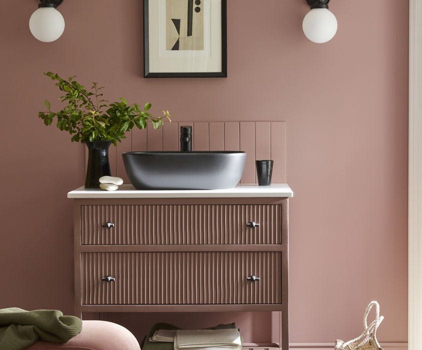
Blush pinks
I’m not talking sugary, Barbie style pink but softer, more “mature” shades. In fact, really they are becoming another neutral, and a much-needed antidote of peace and softness in our troubled world. For a really sophisticated take pair with accents of burgundy for a tonal colour scheme. This versatile hue looks beautiful anywhere – just be sure to choose yellow-based pinks for north facing rooms and cooler, paler pinks for south facing spaces.